After its nationwide rollout on Earth Day, the HeatRisk forecasting tool is getting a real-world test as deadly temperatures stress much of the US.
Created by the US Centers for Disease Control and Prevention and the National Oceanic and Atmospheric Administration, HeatRisk combines public health data and weather forecasts to create a map of threatening heat across the country. Similar to how tornadoes and hurricanes are categorized, the tool ranks heat waves on a scale of 0 to 4 based on how dangerous they are. This metric integrates local climatology — a 90F day in Seattle has more impact than in Las Vegas — the time of year, the forecast daily high and low temperature and the duration of heat.
Each HeatRisk level corresponds to a color: The lowest level, green, indicates “little to no risk,” while magenta signals the highest risk.
California had the first HeatRisk prototype in 2013, and a number of Western states have used a version since 2017, leveraging the tool for public safety measures. Sacramento schools make decisions about outdoor activities based on HeatRisk, and Maricopa County in Arizona uses it for hazard-mitigation planning. Western states have been facilitating the expansion across National Weather Service offices. Through an internal chat system, NWS scientists and public health specialists provide support for states just starting to use the tool.
Since the national launch in April, broadcasters like The Weather Channel and Fox Weather have featured HeatRisk in their reporting and the CDC has been integrating it into heat messaging guidelines.

Heat experts say that local climatology is a game-changer for heat messaging. “Research is showing that localized heat warnings are important, because you learn more about when you need to get the message out and to whom,” says Alina Herrmann, a medical doctor and public health researcher at the Heidelberg Institute for Global Health in Germany.
Chris Dargan, a public information officer at the California Governor’s Office of Emergency Services, says that HeatRisk has improved the office’s heat messaging since it adopted the tool. The governor’s office can now send more geographically specific heat warnings: “There are areas in the state that have a number of industries with outdoor workers, construction workers, and farmers that need more messaging tailored to their needs,” Dargan says.
A food cart vendor places drinks under bags of ice in Times Square during high temperatures in New York on June 20. Photographer: Adam Gray/Bloomberg
The visual simplicity of HeatRisk may prove helpful for the public, says Lance Wood, science and operations officer at NWS in Houston and Galveston, one of the offices that gained access to HeatRisk in April. “We’re taking away exact numbers, which people might not really act on. The color-based system might be more useful to see what’s uncommon and dangerous.”
HeatRisk’s Social Vulnerability Index also identifies vulnerable and economically disadvantaged communities that are more susceptible to heat threats. NWS Seattle works closely with the King County Regional Homelessness Authority (KCRHA), which uses HeatRisk to help unhoused individuals without access to shelter from dangerous heat.
Before starting to use HeatRisk in the summer of 2023, “we were running ragged,” says Tony Machacha, community capacity manager at the agency. Faced with increasingly regular 90F days, it was a challenge to respond to heat waves with only county-wide plans. KCRHA now uses HeatRisk to develop heat safety plans at more specific locations within King County — and can do so starting six days in advance. Homeless shelters and outreach partners have told the agency they do not feel quite as overstretched, according to Machacha.

Even so, the particular way that HeatRisk scores heat events will take some getting used to, says Reid Wolcott, warning coordination meteorologist at NWS Seattle. For some, Wolcott says, “it’s not clear from how you get from one temperature to a certain HeatRisk level, especially if a few weeks ago the same temperature registered as a different level.” (For instance, a 100F day will have a higher HeatRisk in spring compared to the height of summer, when extreme heat is expected.)
HeatRisk has its downsides, Wood notes. It does not account for solar radiation, wind or cloudiness in its metric, all of which are important considerations when assessing dangerous heat.
“We’re still figuring out how exactly this will fit in our heat measurement toolbox, but so far it’s been an extremely useful addition,” Wood says.
Different heat metrics have distinct advantages. Heat index is the “feels like” temperature, combining relative humidity with air temperature. “For day-to-day activities, heat index will serve you well,” the NWS website reads. Wet-bulb globe temperature accounts for multiple other environmental factors, such as wind speed and solar radiation. It’s effective for highly specific locations, Wood explains. It’s also especially useful for athletic organizations and the military, where individuals are expected to participate in vigorous outdoor activity, Wolcott says. HeatRisk — which is calibrated with CDC data — is best for evaluating the impact of heat on the health of the overall population.
Florida’s Seminole County actively uses both the heat index and HeatRisk, according to Alan Harris, the county’s director of emergency management. When there is dangerous and long-duration heat that does not meet the Florida threshold for issuing heat advisories (108F in most of the state), Seminole County decides based on HeatRisk to maintain emergency procedures, even when not under heat advisory.
The rapid acceleration of global warming further complicates the measurement of “uncommon” temperatures. HeatRisk uses a 20-year history to assess how normal a temperature is on a given day. “But it’s been getting substantially warmer in the last five years compared to the 15 before it,” Wood says. With summer temperatures consistently breaking records and creating heat domes, “HeatRisk’s climatology is going to have to be updated every few years in order to keep it relevant.”
Wood reached out to other NWS offices for advice in early May, asking if it was correct when HeatRisk registered a whole week in Houston as magenta. One of the more experienced offices responded to help: The forecast was accurate. When compared with data from just 20 years ago, they said, entire weeks in spring and early summer could be now considered dangerous.
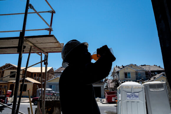
Top photo: A construction worker hydrates during a heat wave in Folsom, California, on July 3.
Was this article valuable?
Here are more articles you may enjoy.


 FM Using AI to Elevate Claims to Deliver More Than Just Cost Savings
  These Five Technologies Increase The Risk of Cyber Claims
  Portugal Rolls Out $2.9 Billion Aid as Deadly Flooding Spreads
  Uber Jury Awards $8.5 Million Damages in Sexual Assault Case