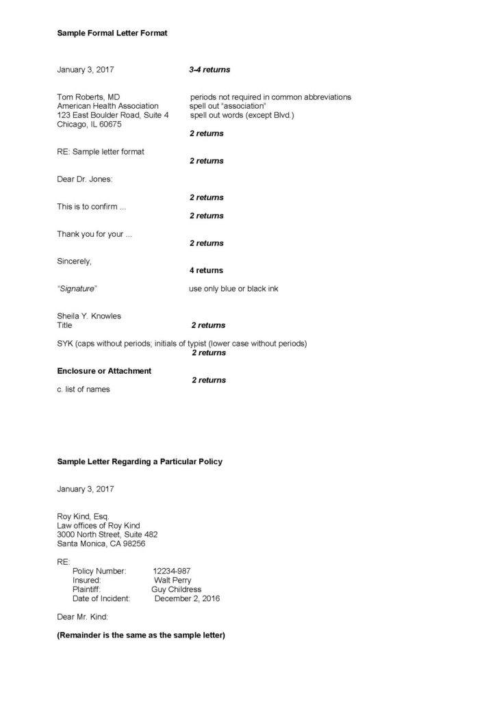
How do you format a claims letter? Insurance companies seem to be in search of a reliable, reasonable format that will help their letters achieve a consistent, easy-to-read “look.”
The following are some tips on gaining consistency in a business letter:
Letterhead
| Style: | Full block –everything aligns left margin |
| Justification: | Left, ragged right (not block justified) |
| Font: | Times New Roman 12pt (scalable) for letters and memos Times New Roman, 10pt (scalable) for agendas and minutes |
| Spacing: | 1.0 |
| Margins: | Left 1.6″; right 1″; top 2″;bottom 1″ |
| Signature: | “Sincerely” as closing, title spelled out and four spaces for the signature. Use blue or black ink to sign name. Do not use “Truly yours” as a closing. An actual signature is always preferable to a stamp. |
Envelopes
- The address should be in all capital letters with no punctuation.
- Left-justify every line in the address block.
- Use two letter state abbreviations in caps (e.g., CA, NY, HI, MN).
- Use one space between city and state, two spaces between state and zip code.
- The address portion should be centered halfway down the envelope and a half-inch less than half-way across.
Example:
| Letterhead | Envelope |
|---|---|
| Ron Smith, M.D. | RON SMITH MD |
| Locke Clinics Inc. | LOCKE CLINICS INC |
| 233 East Derby Street Chicago, IL 60654 |
233 EAST DERBY STREET CHICAGO IL 60611 |
NOTE:
If a window envelope is used, the same rules as apply above. Be sure that only the full address is visible through the window portion of the envelope. Plain white paper
| Style: | Full block –everything aligns on the left margin |
| Justification: | Left, ragged right (not block justified) |
| Font: | Times New Roman, 10pt (scalable) |
| Margins: | Left 1″; right 1″; top 1″;bottom 1″ |
Was this article valuable?
Here are more articles you may enjoy.


 Founder of Auto Parts Maker Charged With Fraud That Wiped Out Billions
  Tesla Sued Over Crash That Trapped, Killed Massachusetts Driver
  LA County Told to Pause $4B in Abuse Payouts as DA Probes Fraud Claims
  Credit Suisse Nazi Probe Reveals Fresh SS Ties, Senator Says